Microsoft Excel
Workbook structure, formulas, charts, and dashboard layout
Excel was used to organize data, prepare metrics, and create a dashboard layout suitable for reporting.
Data Analytics Case Study
A practical Excel dashboard project designed to summarize sales performance, highlight key metrics, and make business information easier to review, explain, and share. It is a self-directed practice project using sample data, not a client engagement or a claim of verified business impact.
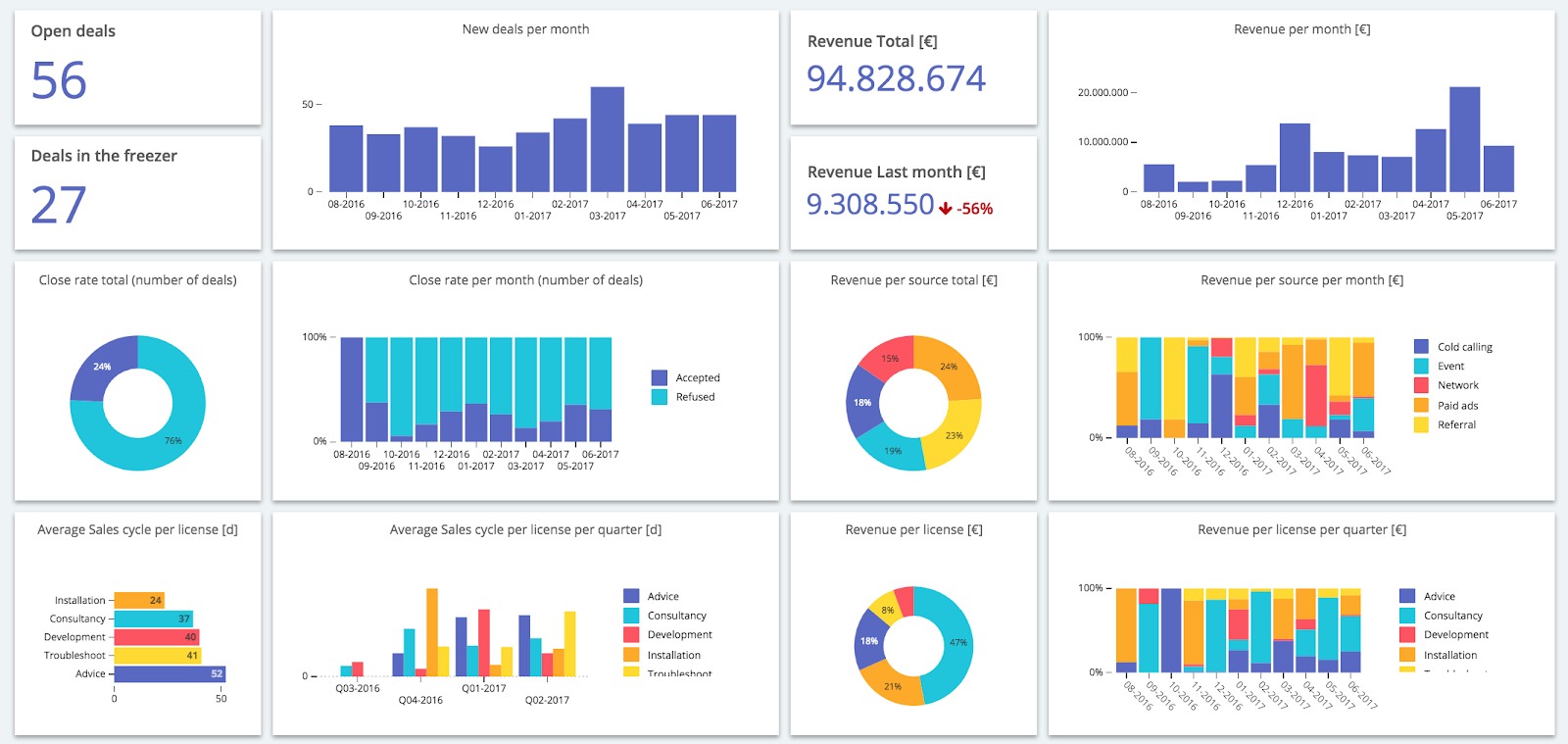
Sales information can become difficult to review when it is stored only in raw spreadsheet rows. Decision-makers need a simple way to understand performance without manually searching through data.
Build a clear Excel dashboard that summarizes important sales indicators and presents performance information in a readable, decision-friendly format.
Small business owners, managers, sales teams, or operational staff who need a fast view of sales performance.
A published dashboard PDF, an Excel source workbook, and a GitHub repository containing the project files.
Excel was used to organize data, prepare metrics, and create a dashboard layout suitable for reporting.
Charts and KPI cards were used to make important information easier to scan and understand.
The workbook structure was prepared to support cleaner reporting and easier dashboard interpretation.
GitHub was used to publish the project files and make the dashboard accessible for review.
KPI-style elements help users understand the most important values without reading the full dataset.
Trend visuals help users see how performance changes across periods.
Comparison visuals make it easier to identify stronger and weaker performance areas.
The dashboard was organized so it can be shared as a PDF or reviewed directly from the workbook.
The dashboard turns spreadsheet information into a cleaner visual summary that is easier to review.
The dashboard format helps explain performance without requiring the viewer to inspect every raw row.
The workbook structure can be improved and reused for similar small business reporting needs.
The project provides visible proof of dashboard design, Excel reporting, and analytics presentation skills.
A dashboard should make information easier to understand, not just more colorful.
A well-organized workbook makes dashboard building and future updates easier.
Charts are useful when they help users compare, detect trends, or understand performance quickly.
Sharing the PDF, Excel file, and repository makes the project easier for recruiters and clients to review.
Open the dashboard PDF, download the Excel workbook, or review the repository on GitHub.
I can help clean data, organize spreadsheets, create reports, and build practical dashboards for small businesses, teams, NGOs, and field operations.